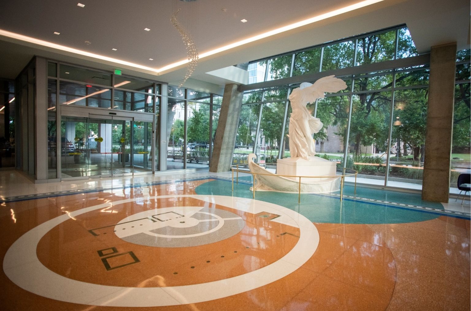
Lobby Entrance
Inspired by the ancient Greek healing centers known as Asclepieia, Museo’s lobby is conceived as a threshold. It is an intentional moment of arrival that allows visitors to orient themselves before entering the clinical environment.
The entrance is designed to receive visitors directly at the lobby doors, allowing patients and guests to be dropped off in immediate proximity to the interior space. This approach supports a calm, continuous transition from city to building.
More than 6,000 square feet of Thasian white marble was sourced specifically for the lobby, reinforcing material integrity while establishing a sense of cultural continuity.
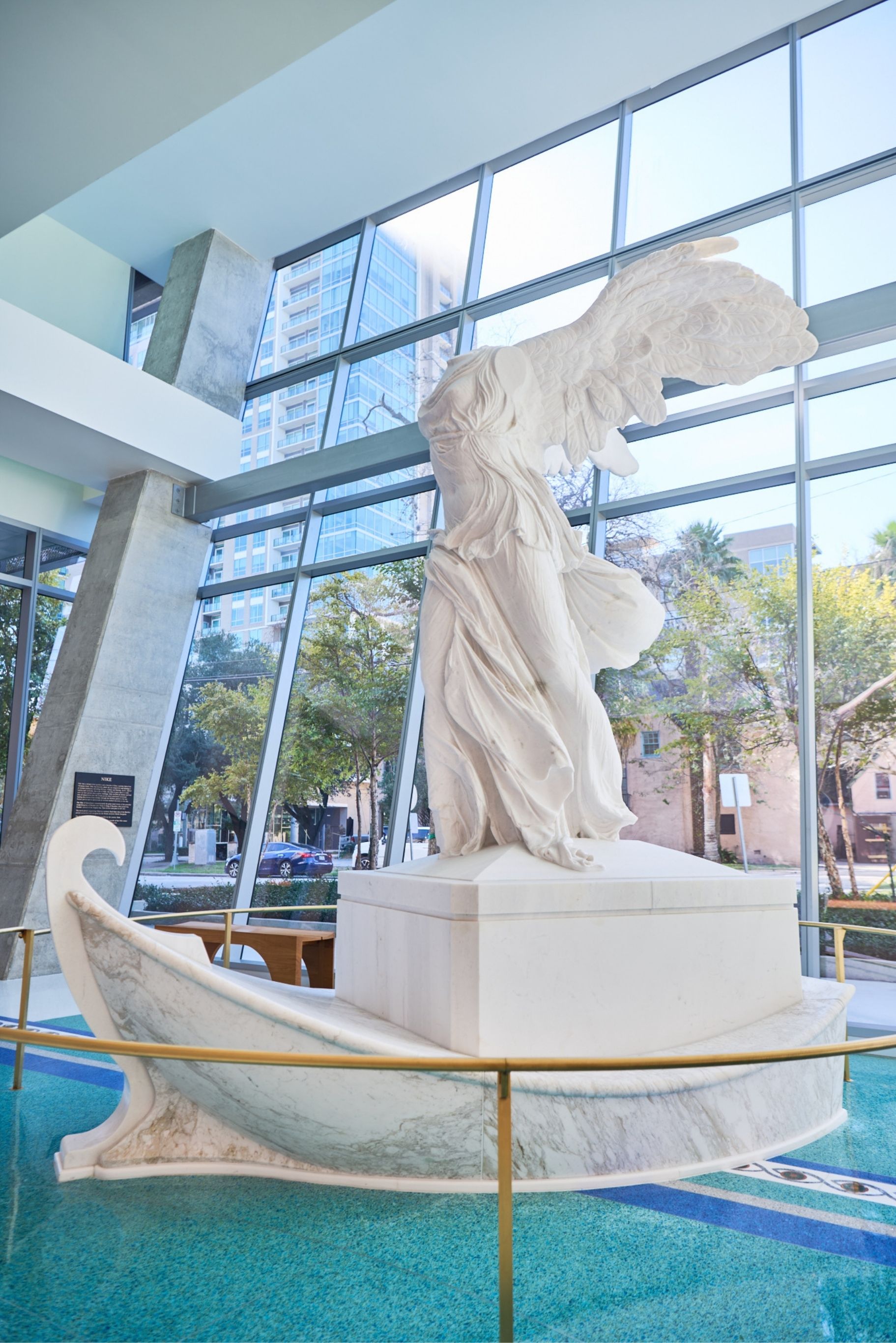
Winged Victory of Samothrace
Positioned at the center of the lobby, the Winged Victory of Samothrace (Nike) introduces a historical reference into Museo’s contemporary setting. Created in the 2nd century BC, the original sculpture has long been associated with movement, endurance, and forward momentum.
The sculpture at Museo is a faithful reproduction of the Hellenistic original, carved from Thasian white marble. Rather than functioning as spectacle, it is situated as a point of quiet orientation. Its forward leaning posture and open form suggest continuity and resolve without instruction or narrative.
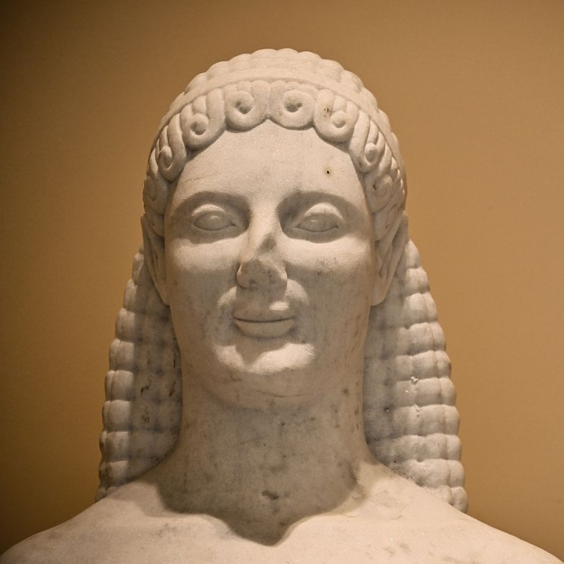
Kouros
Set within a quiet alcove of the lobby, the kouros introduces an early historical reference to the study of the human form. Originating in the Archaic period of ancient Greece, kouroi were among the earliest sculptural explorations of proportion, posture, and anatomical clarity.
The sculpture represents an idealized human form, long associated with the concept of arete, the alignment of physical and moral excellence. Its calm expression and measured stance allow it to remain present without narrative, reinforcing Museo’s emphasis on dignity.
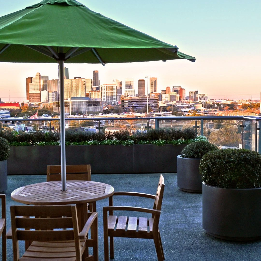
Rooftop Terrace
The rooftop terrace is positioned to take advantage of expansive views of downtown Houston. Extending beyond the training center, the landscaped outdoor patio offers a pause within the building’s vertical movement.
The space supports gathering, reflection, and informal exchange. It accommodates moments ranging from quiet conversation to celebration, allowing social life to unfold naturally within the architectural rhythm of the building.
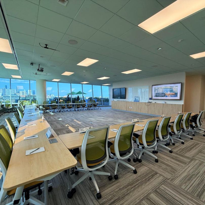
Training Room
Located on the seventh floor and overlooking the city, Museo’s training center provides a focused environment for learning and collaboration. Advanced technology and flexible layouts support education as a lived practice that is integrated into the daily rhythm of the building.
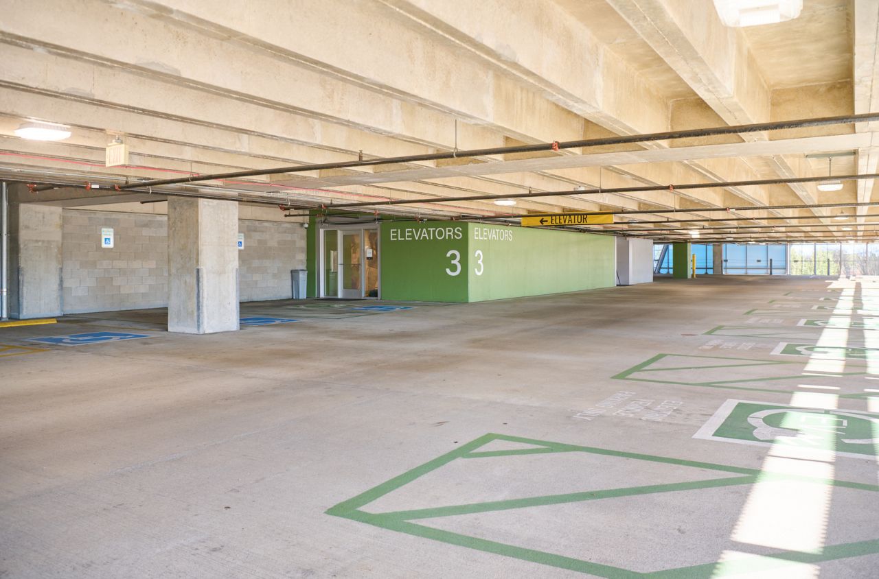
Garage
Arrival begins in the garage. From any level, visitors can access physicians’ offices directly, allowing movement through the building to remain clear and continuous. This continuity reduces unnecessary transitions and supports a sense of calm and coherence from the earliest point of arrival.
Visitors parking in Museo’s 470-car facility encounter floor-to-ceiling murals within elevator vestibules on each level. The five garage levels feature reinterpretations of works by Impressionist masters, introducing art as guidance rather than destination.